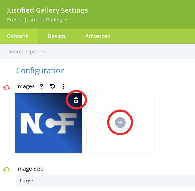
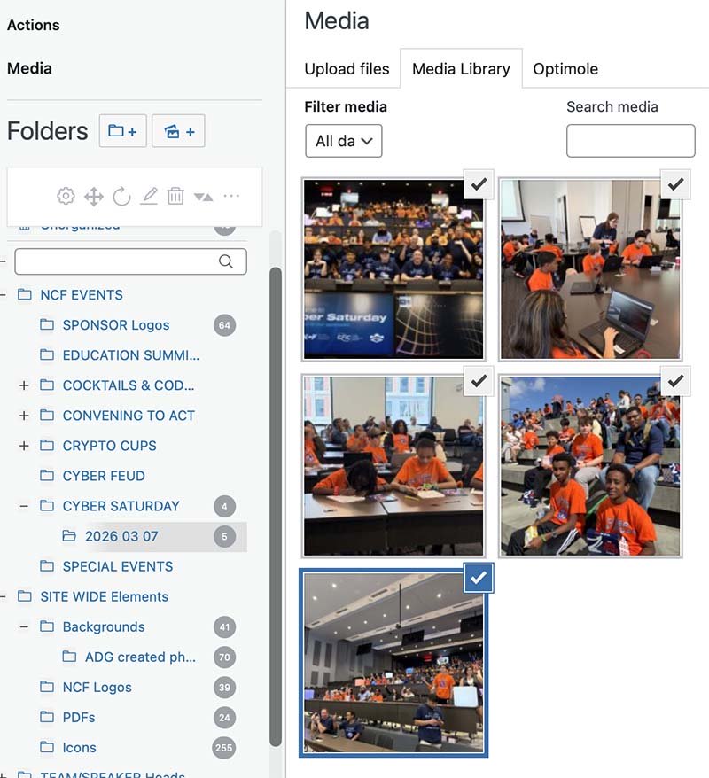
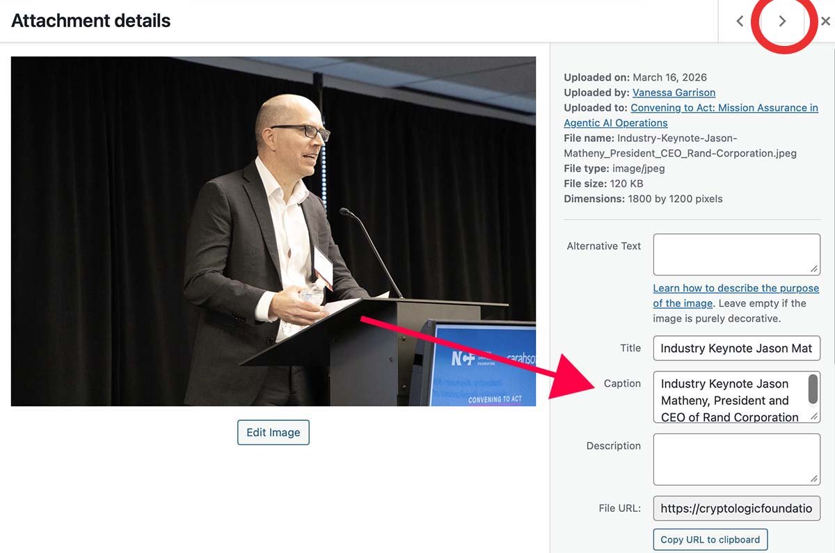
The Template Library has several options to choose from depending on what you need.
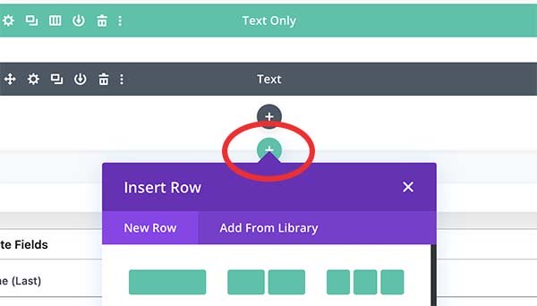
Access the specialty rows by clicking the green + and selecting Add from Library.
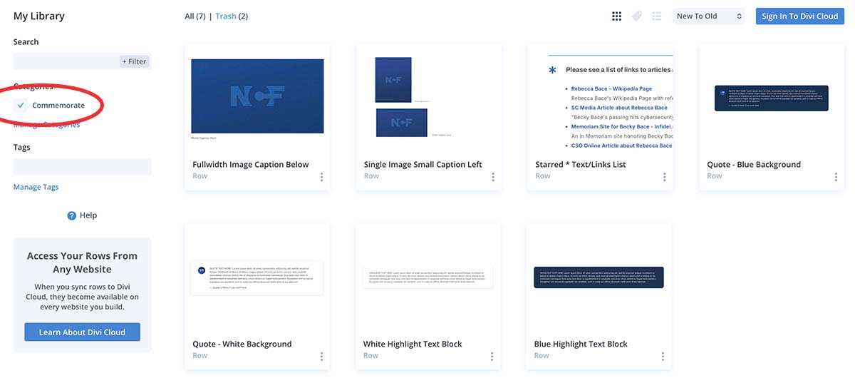
Click on the appropriate Category to refine your search. You can use the search option to find something specific. Select the row you need from the Library.
Highlighted Text Options
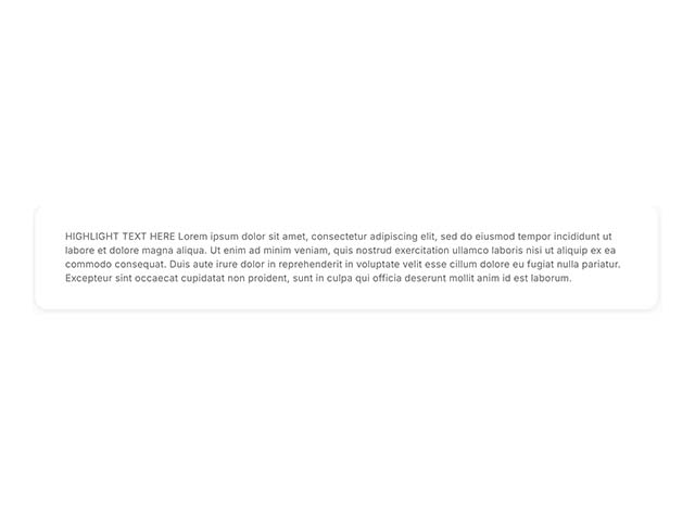
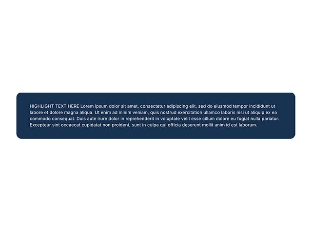
Blue or White Highlight Text Blocks
Useful to highlight a short bit of text. Use the gear setting to open the text module to replace the placeholder text.
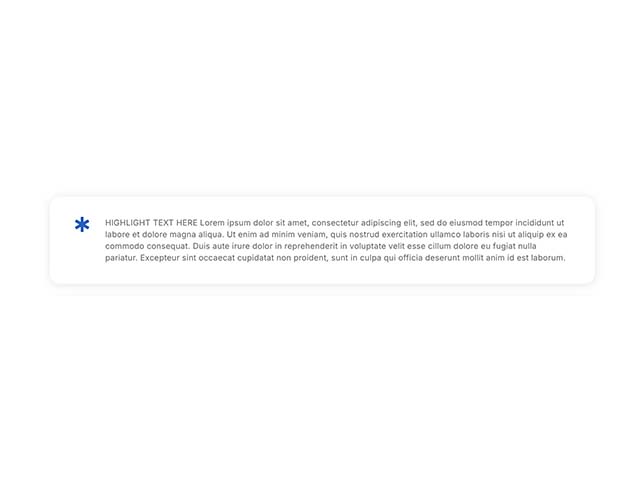
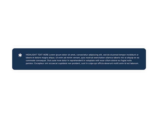
Blue or White * Highlight Text Blocks
Useful to really draw attention to highlighted text. Use the gear setting to open the text module to replace the placeholder text.
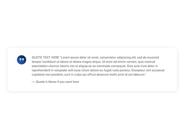
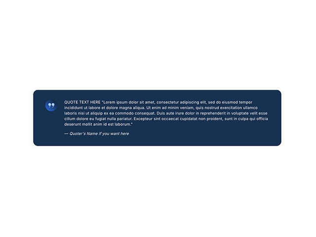
Quote - Blue or White Background
Use the gear setting to open the text module to replace the placeholder text.
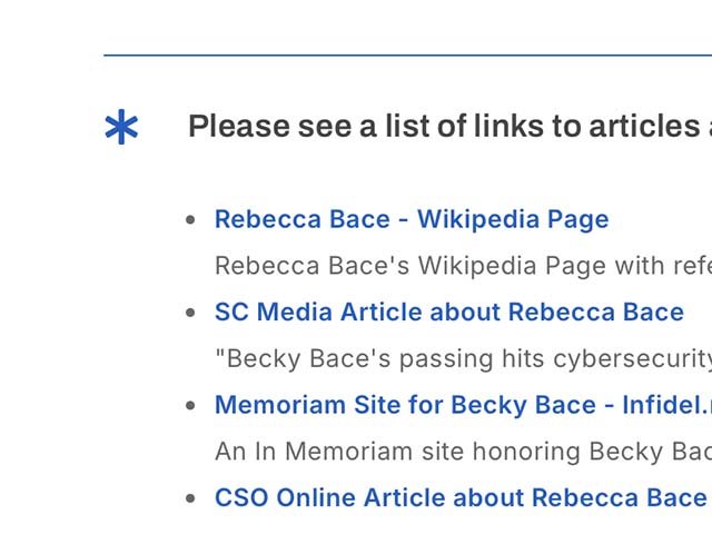
Starred * Text/Links List
I’ve used this style anywhere the previous content has used ***
There are two text blocks in this row – one for a list and one for just text. Delete whichever one you aren’t using.
Heading Only
Replace the placeholder heading and select the header level you need.
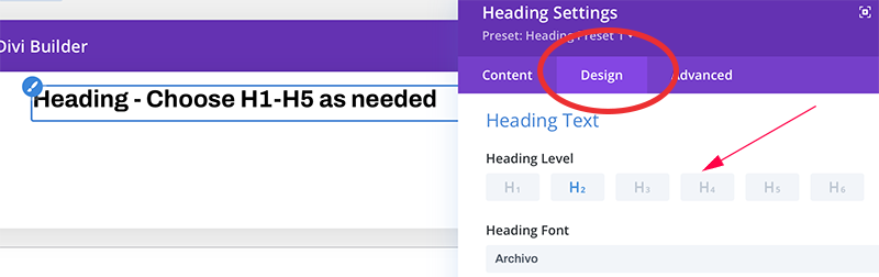
Image and Gallery Options
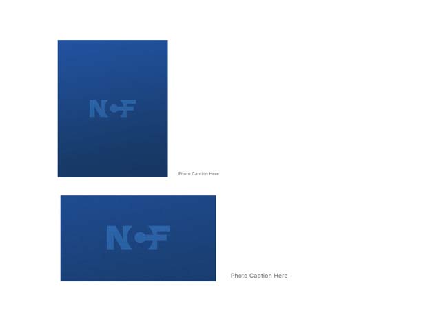
Single Image Small Caption Right
This is useful for sharing images that look better small whether due to file quality or orientation.
Click on the image gear icon to replace the placeholder image with one from the Media Library.
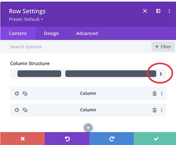
Use the row gear icon to open the settings and select the column ratio that works best for the image size you want.
Add the image caption to the right of the image or delete that text module.
Fullwidth Image Caption Below
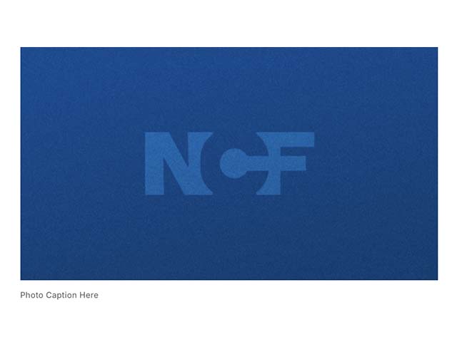
This is ideal for high res horizontal feature type images.
Click on the image gear icon to replace the placeholder image with one from the Media Library.
Add the image caption below the image or delete that text module.
Justified Image Gallery